Background
Traditionally, telecommunication contracts have been lengthy and filled with legal jargon that can be difficult for many people to comprehend. nju mobile recognised and aimed to address this challenge by transforming their contracts into a more accessible format. They understood that simplifying the language and presenting the information in a visually appealing manner would improve comprehension and inclusivity.

How accessibility was included in the campaign
- Translating contracts into Instagram posts:
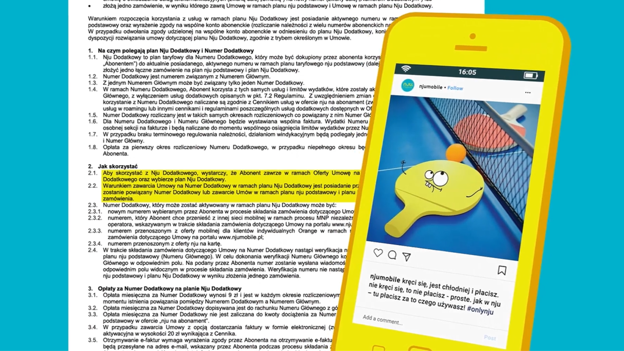
nju mobile took a creative and practical approach by translating their long contracts into bite-sized Instagram posts. By breaking down the complex information into visually appealing and concise posts, they made it easier for users to understand the terms and conditions of their contracts. This approach simplified the content and made it more engaging and accessible to a broader audience.
- User-controlled audio:
Understanding the importance of catering to diverse needs, nju mobile implemented user-controlled audio features. This feature allows individuals with visual impairments or those who prefer audio-based information to access the content effectively. By providing audio options, nju mobile ensures that individuals with different abilities can consume the information in a way that suits them best.
- Writing to a low literacy level:
To ensure that the information conveyed in the contracts is understandable to a broad range of users, nju mobile adopted a simple and concise form of communication. They used clear and straightforward language, avoiding technical terms and complex sentence structures. This approach benefits individuals with lower literacy levels or those who may struggle with comprehension.
- Avoiding images of text:
Recognising the limitations faced by individuals with visual impairments or those using screen readers, nju mobile made a conscious effort to avoid using images of text. Instead, they provided text directly, ensuring all users could access and understand the information without relying on visual content.
- Avoiding abbreviations:
Abbreviations can create confusion, especially for individuals unfamiliar with industry-specific terms. nju mobile consciously chose not to use abbreviations in their contracts, promoting clarity and ease of understanding for all users.
- Adequate touch target area:
nju mobile designed its digital interfaces, including Instagram posts, focusing on usability and accessibility. They ensured that touch targets, such as buttons or links, were large enough to be easily tapped or selected by users with various motor abilities, reducing the risk of accidental interactions and improving the overall user experience.
Understanding the importance of customisable text sizes for individuals with visual impairments or those who prefer larger fonts, nju mobile allowed users to resize the text without compromising the layout or functionality of Instagram posts. This flexibility ensures that individuals can comfortably read the content according to their visual needs.
- Colour contrast checking:
nju mobile prioritised colour contrast in their designs to ensure optimal readability for all users, including those with visual impairments or colour vision deficiencies. By conducting colour contrast checks, they guaranteed that the text and graphic elements had sufficient contrast, making it easier for users to distinguish and comprehend the content.
Recognition
The campaign was awarded with a KTR Award.


